6 minute read

Building MyServiceVisit: a game-changing mobile app for private jet maintenance

Company

My Role

Lead Product Designer

Team

6 engineers, 1 product manager

Impact

We shipped Bombardier’s first native application in the Apple and Google Play Store! Check out myServiceVisit below.

Context

Before I joined the team, Bombardier Aerospace developed a BETA version of the application. My task was to improve the user experience, define the scope, and create new features for the MVP and future releases. 

The problem

🚨

Bombardier Aerospace was losing maintenance proposals to other service providers.

🫥

No transparency showing the status of the maintenance event.

🐌

Inaccessible and slow method to approve new work orders.

🗣️

Poor communication between director of maintenance and project manager

The problem

🚨

Bombardier Aerospace was losing maintenance proposals to other service providers.

🫥

No transparency showing the status of the maintenance event.

🐌

Inaccessible and slow method to approve new work orders.

🗣️

Poor communication between director of maintenance and project manager

🚨

Bombardier Aerospace is losing maintenance proposals to other service providers.

Defining Goals

As a director of maintenance I want to...

1.

Clearly see the status of my aircraft during the maintenance event

2.

Quickly approve, reject, or inquire about any additional work that needs to be done on my aircraft.

3.

Easily find and contact my Bombardier project manager in charge of my maintenance event.

Designs

I created the information architecture and redesigned the navigation for the application. I decided to separate the three main goals into three seperate tabs. Our users are not technical people and are very busy. If we combined too many functionalities in one tab, the user may become overwhelmed, frustrated, and lost. Also, while planning for future releases, I realized that many new features will build upon the “Status, Work Orders, and Contact” tabs so we could scale the app easily. 

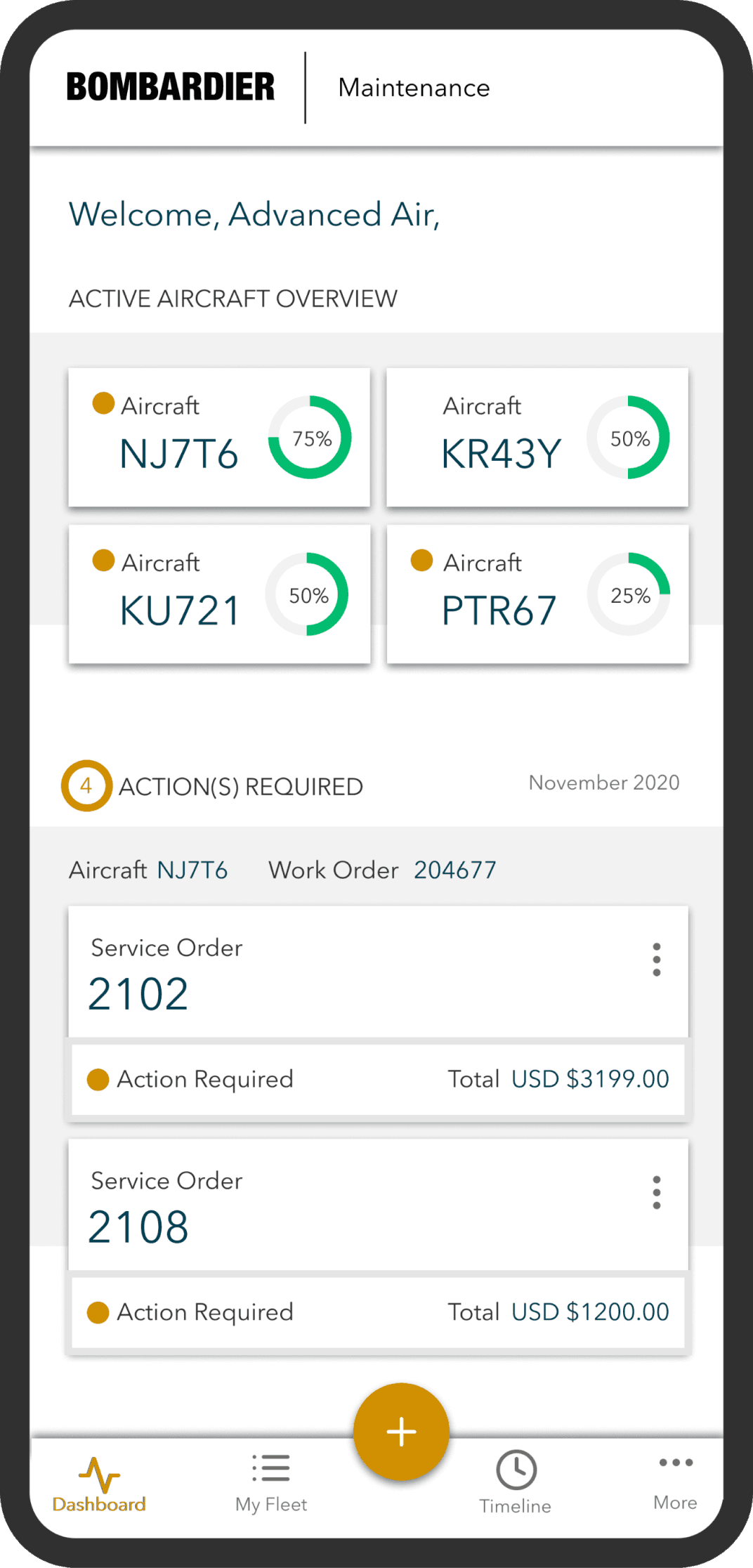
Beta version

My redesign

Goal 1

Goal 2

Goal 3

Goal 1

Goal 2

Goal 3

Goal 1 - View the status of your aircraft

At first, we defined status as a percentage of work completed during a maintenance event. However, I realized that a percentage is too vague and that we should define status by the amount days it takes to complete a maintenance event. See how I designed the Status feature below. 

Beta version

My re-design

Status Card

Designing Work Orders

Selecting a Work Order

Second Confirmation

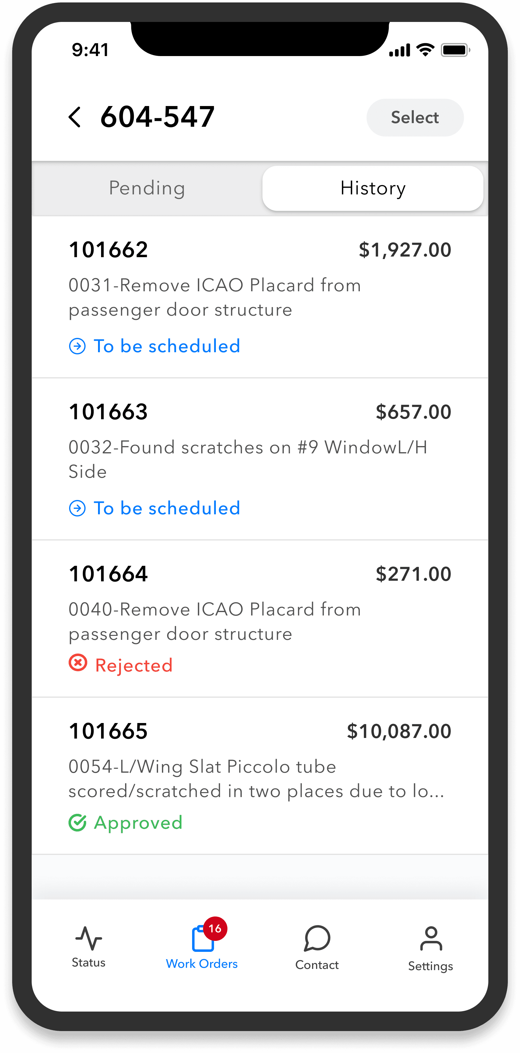
History Tab

Work Order Status

Beta version

My re-design

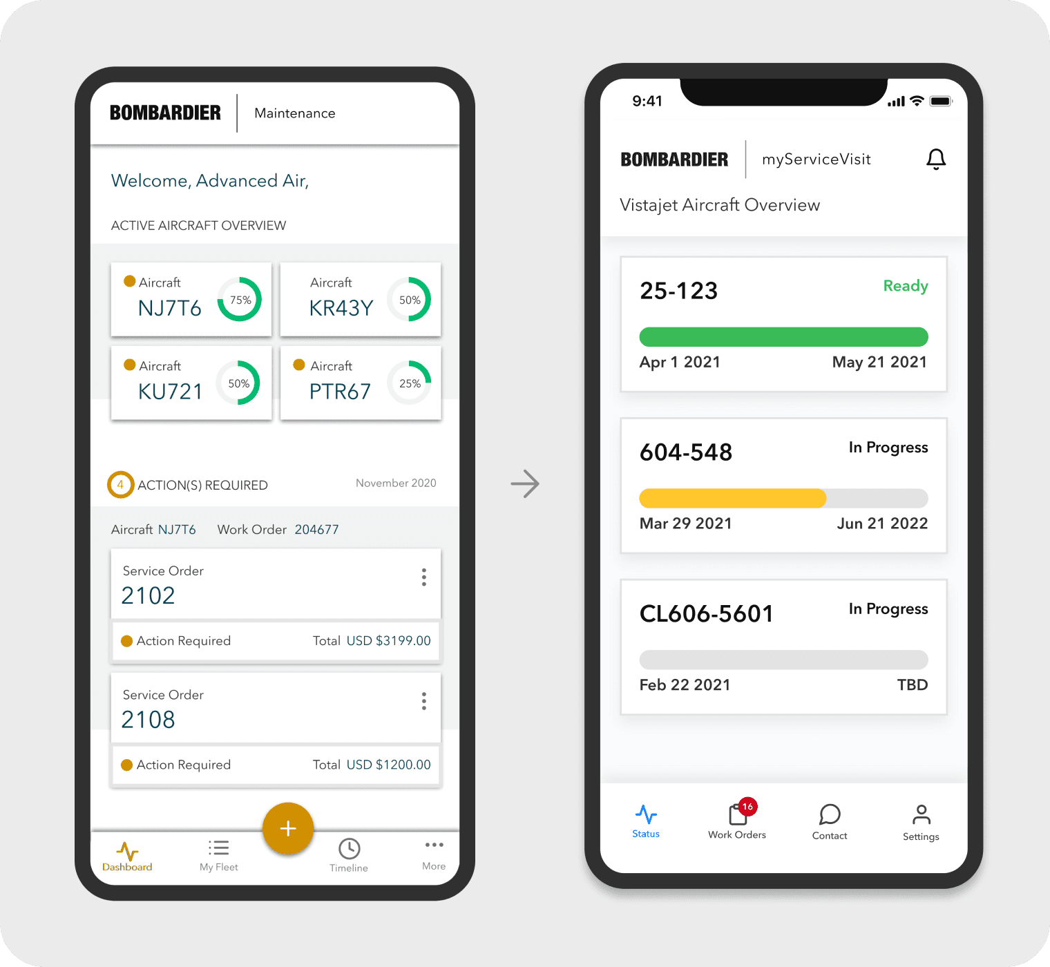
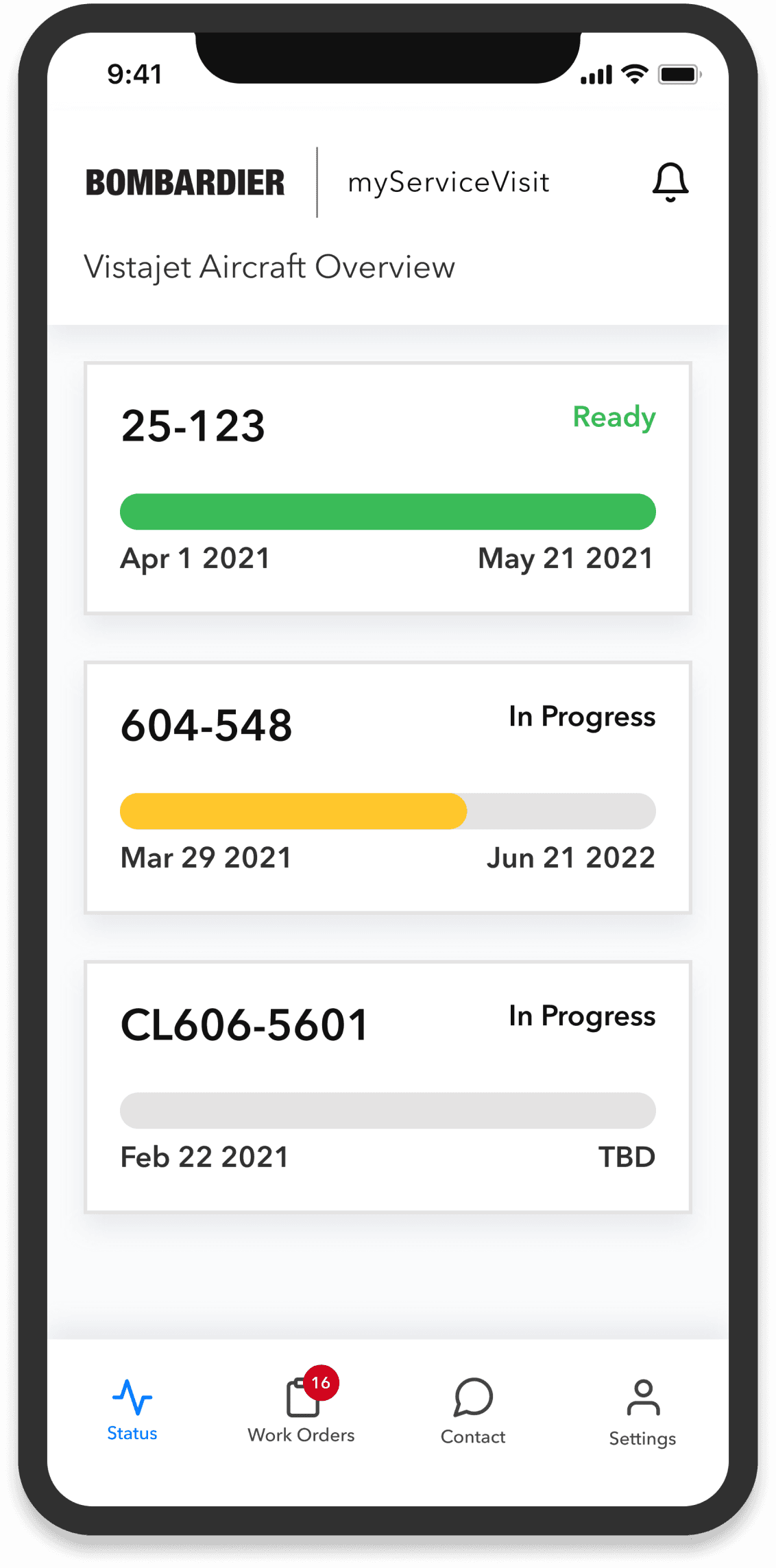
Added notifications on landing page so the user will see key updates right away

I added color coding to quickly indicate the status of the aircraft, allowing users to see when it is ready at a glance. For users who are color blind, the status is also clearly displayed in the top right corner.

A user can have over 20 aircraft in service at once. In this scenario, the 'Actions Required' section, an important part of the app, can be pushed off-screen by the aircraft cards, necessitating excessive scrolling and creating a usability issue.

Biased percentages, no

color hierarchy, and no need to repeat the word “aircraft.”

I moved the 'Actions Required' section to Tab 2 and renamed it 'Work Orders' for clarity. This change helps users focus on the status of their aircraft and ensures they are aware of all necessary actions.

Status Card

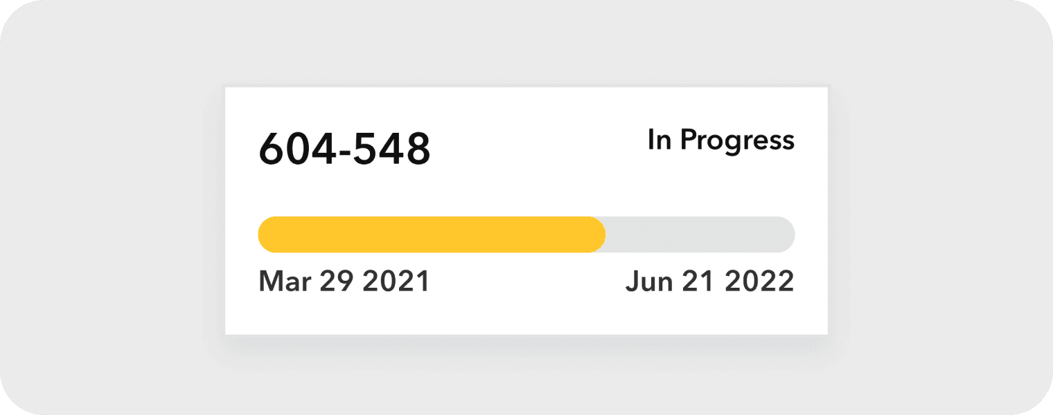
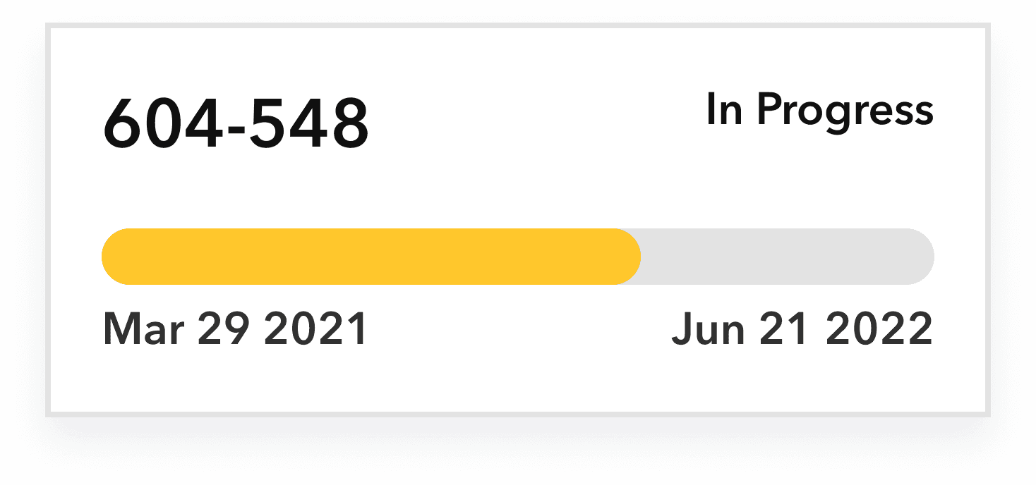
I used the aircraft serial number as the key identifier for each card, since research shows users will always know it. The serial number remains constant, even if the aircraft is sold.

I created a progress bar to show the status of an aircraft’s maintenance. Initially, the status was based on the percentage of work orders completed, but this was misleading—90% completion might still leave a month of work remaining. Instead, I switched to using days to reflect status, which provides a clear and consistent timeline for when the aircraft will be ready for pickup.

Goal 2 - Approve Work Orders

Work orders are tasks that a technician completes during a maintenance event. For example, painting the aircraft or changing the tires would be considered work orders. There can be around 250-500 work orders per maintenance event. Which is a lot! Most of these work orders are pre-approved during the proposal phase. However, technicians find defaults while they are working on the aircraft. Legally, a technician must report the default to the customer and get their approval to fix it.

My task was to streamline this process and create an easy way for customers to easily approve work orders that are reported by the technician during the maintenance event. 

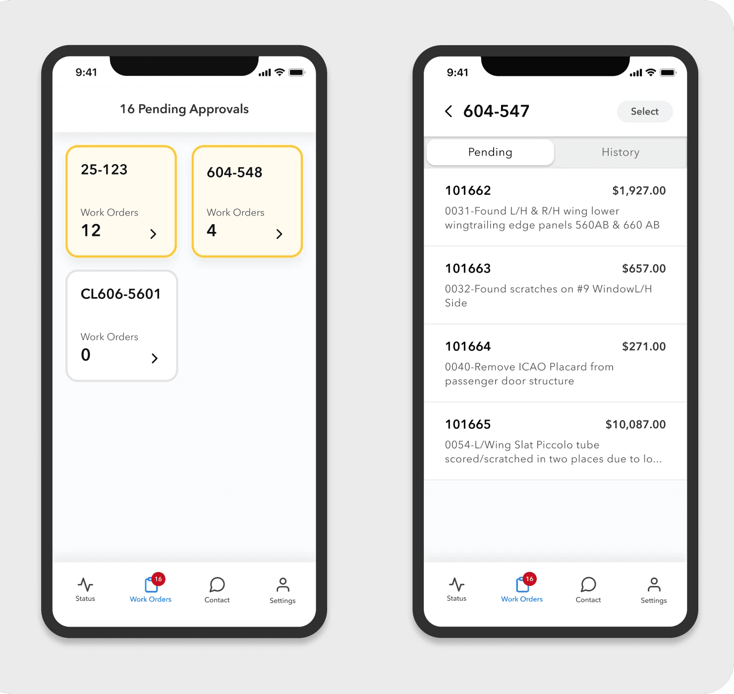
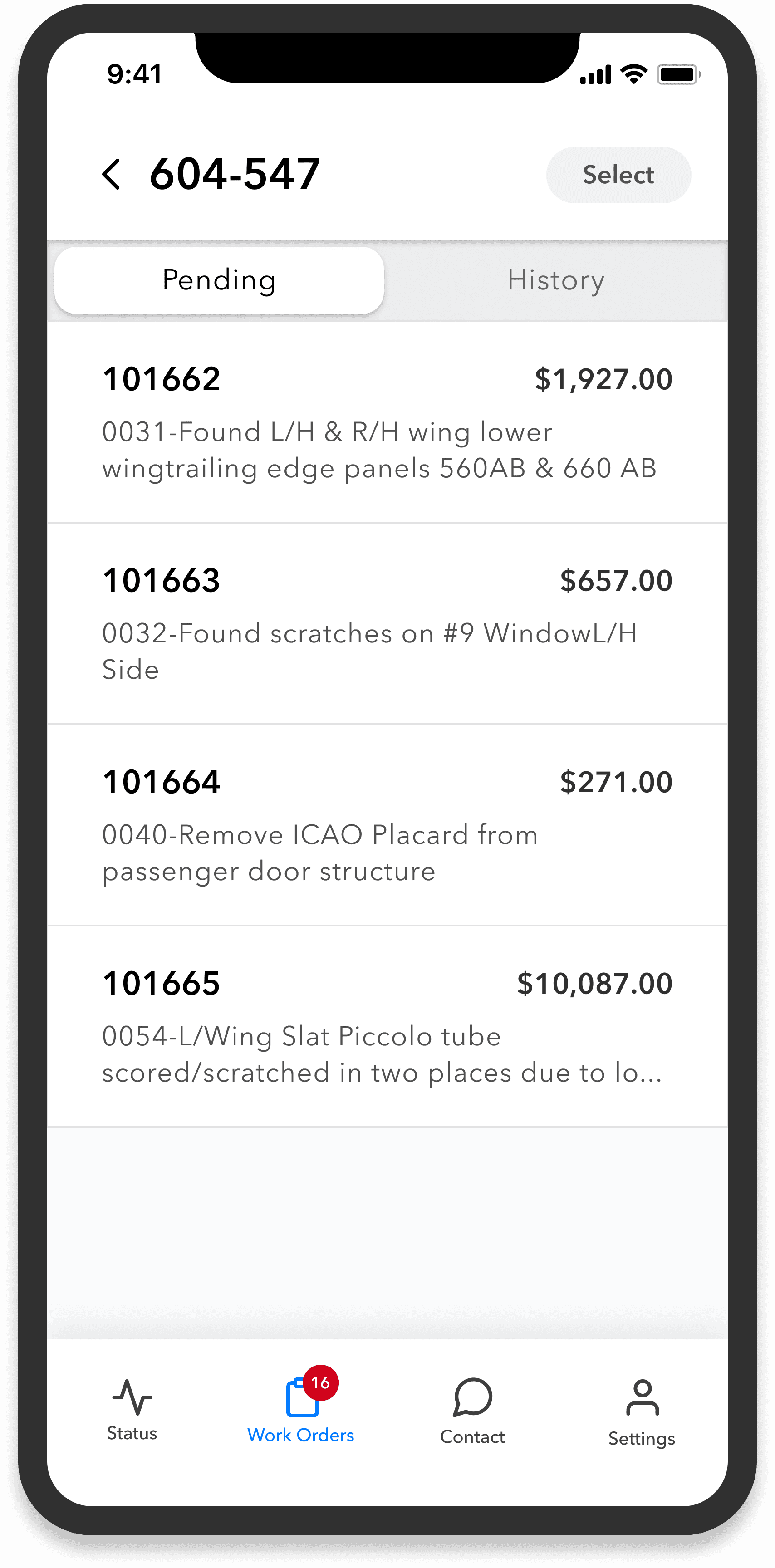
I added 'Select' and 'Select All' options to streamline approval for high volumes of 250+ work orders. Previously, users had to approve each work order individually, which was time-consuming. Feedback showed that users often approve work orders under $1,000 without review to save time.

I redesigned the work order card to display more information at a glance, so users no longer need to click into each one to see details like description and price. Now, users can easily reference work orders in one location, which helps prevent confusion when reviewing 250+ work orders.

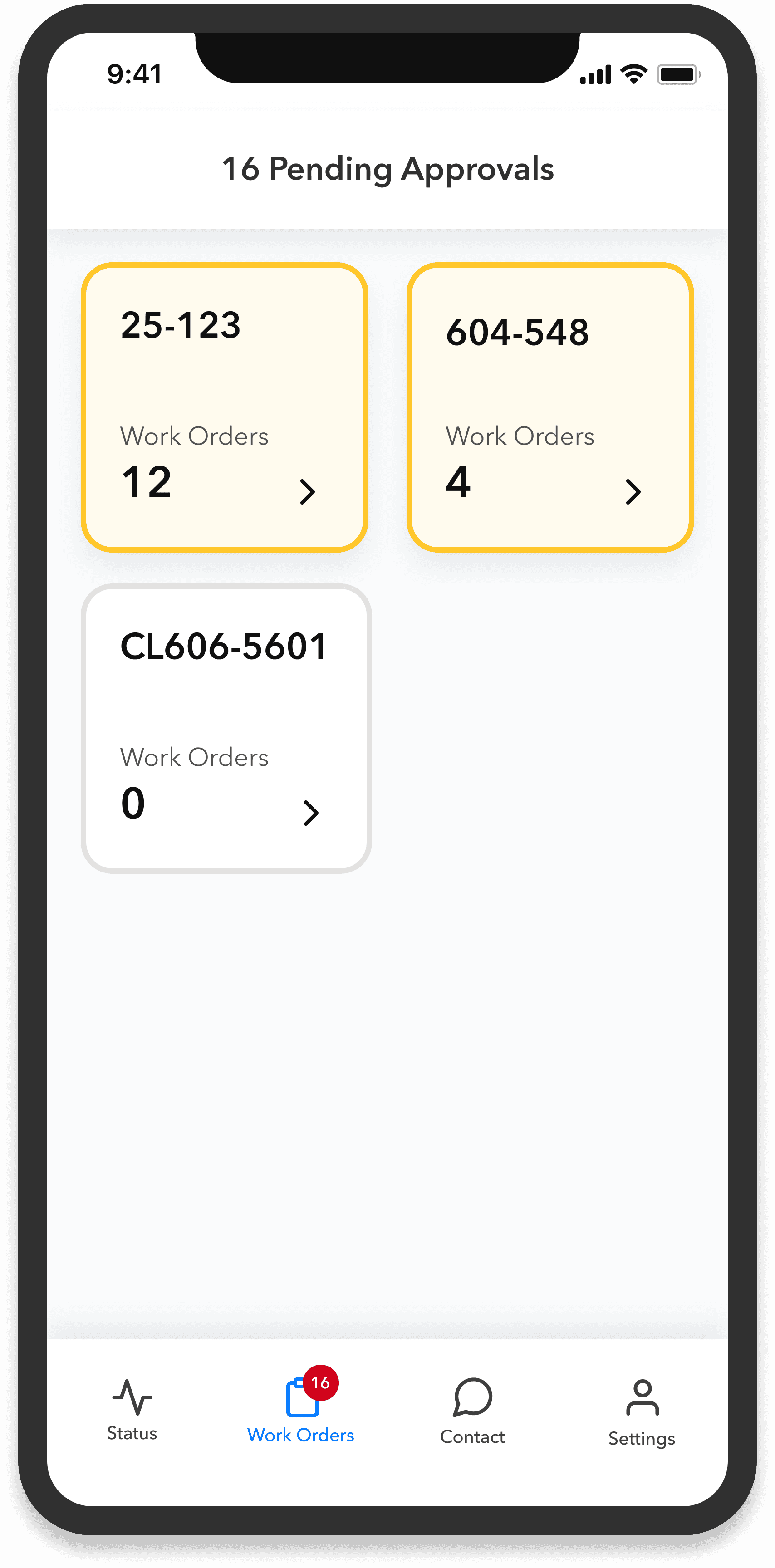
I gamified the experience to prompt timely work order approvals and keep maintenance on track. A yellow box indicates there are pending approvals, and it turns white once all approvals are completed. This visual cue encourages action, while consistent labeling by aircraft serial number ensures clarity on which approvals are needed.

I added a calculation for total pending approvals across all aircraft. Previously, users could only see pending approvals per aircraft, but this broader view helps ensure no required actions are missed when managing multiple aircraft.

Designing Work Orders

Selecting a Work Order

Second Confirmation

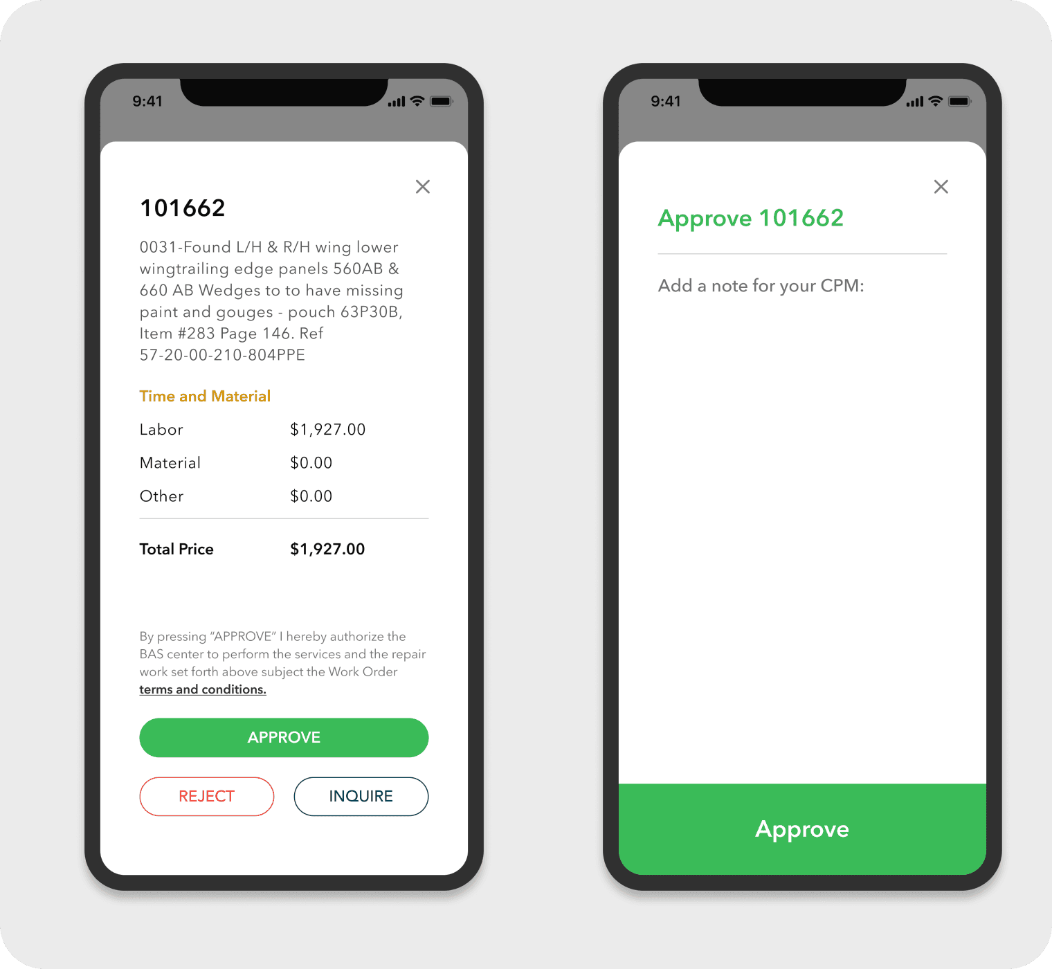
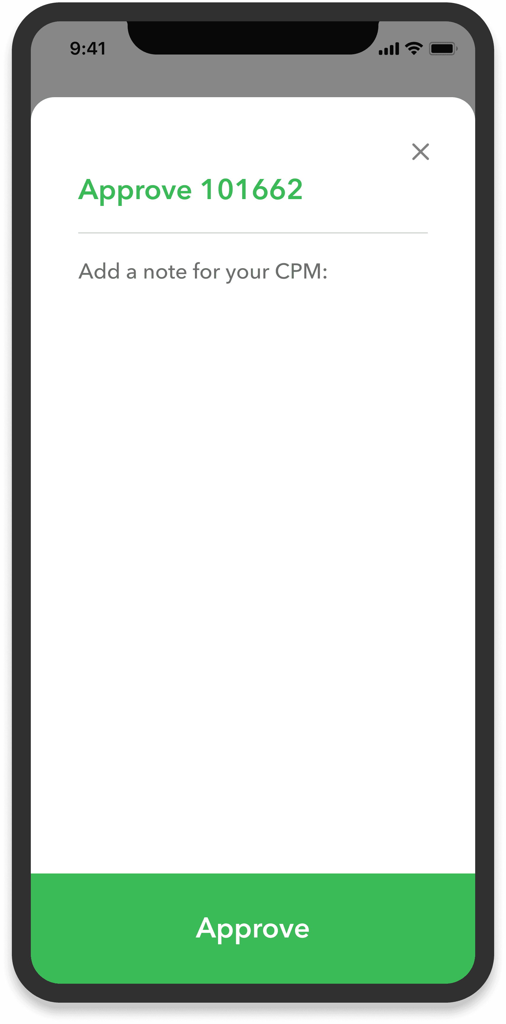
I added a second confirmation screen to allow users to cancel their previous selection if they accidentally click it. This change reduces errors and extra work for the service center while providing customers with greater comfort and flexibility during the approval process.

I maintained the color green on the second confirmation page to promote consistency throughout the application. This color choice provides users with reassurance that they are approving the work order without needing to read the text.

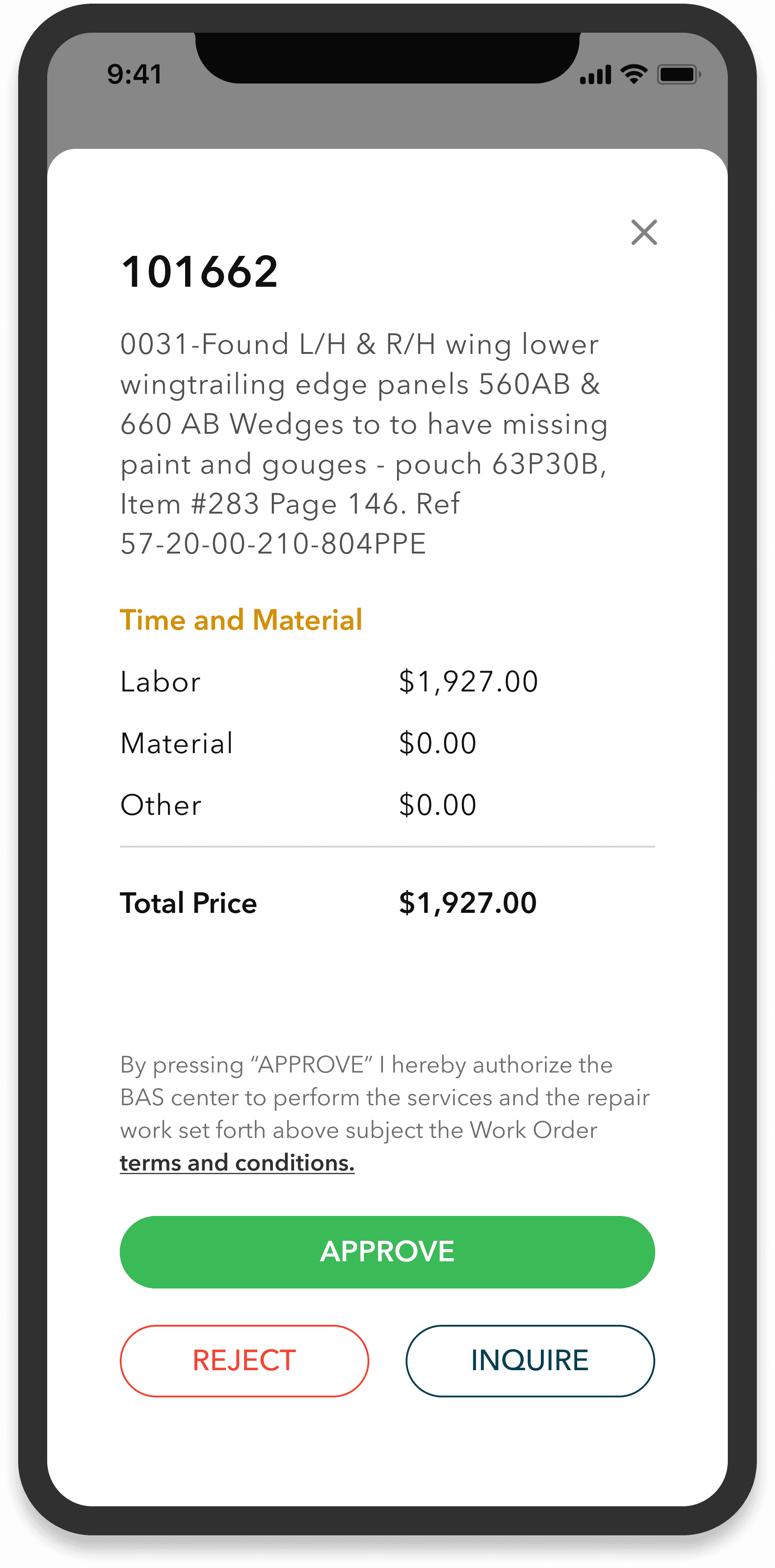
I designed the 'Approve' button to be the largest, as users select it 95% of the time, making it easy to press. This supports our business goal of streamlining work approvals. I also added a color variable to improve the user experience, allowing users to confidently recognize their action without needing to read the button label.

I implemented a pop-up format for approving work orders to prevent users from feeling disoriented in the app. In the Beta version, many users reported feeling lost, so the pop-up allows them to safely close a work order and return to the previous screen without losing their place.

History Tab

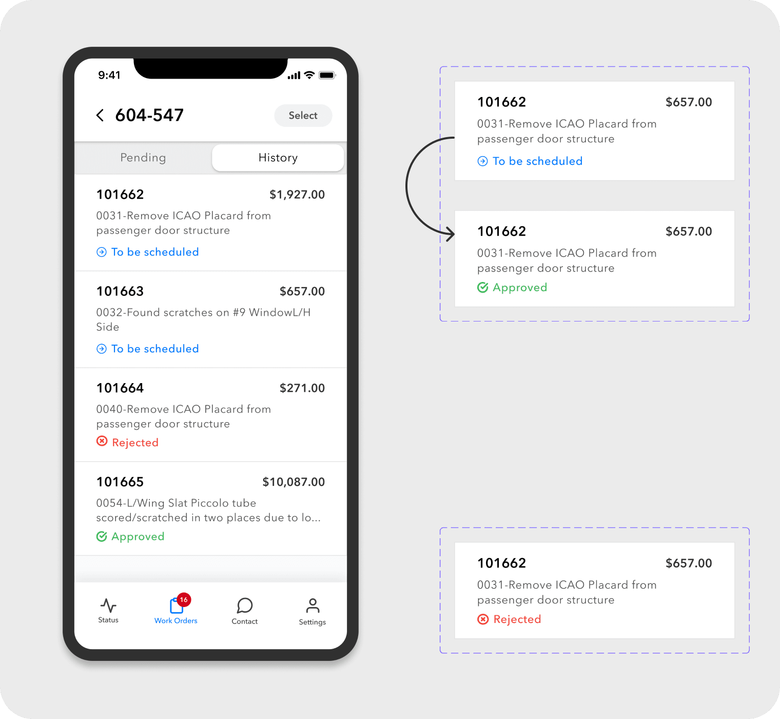
Work Order Status

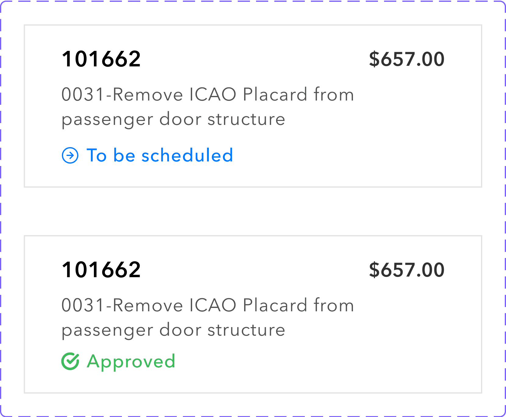
Once a user approves a work order, it is sent to the service center for review. I recognized that a lag exists between the customer's approval and the service center's review, so I collaborated with our development team to create an interim state that indicates the work order is being processed. Previously, the data system did not register the customer's approval until the service center reviewed it, leaving the work order in the pending tab. Now, with the interim state, customers receive immediate feedback, and the work order is moved to the History tab as 'To Be Scheduled.'

When the service center reviews the approval and enters the work order into their system, the status in the app changes to 'Approved.'

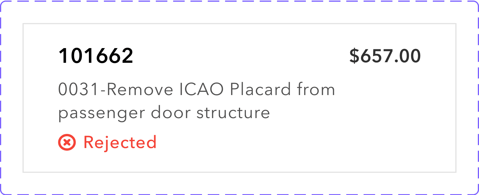
When a customer rejects a work order, it is immediately moved to the History tab as rejected. An interim state is not needed for rejections because the work order does not require review by the service center.

Reflections and Takeaways

I had a great time designing myServiceVisit and I am very excited to see our app scale in the future! 

Made with 💛 & 🍵

Made with 💛 & 🍵

Made with 💛 & 🍵

Beta version

My redesign

Goal 1

Goal 2

Goal 3

Goal 1

Goal 2

Goal 3

Designs

I created the information architecture and redesigned the navigation for the application. I decided to separate the three main goals into three seperate tabs. Our users are not technical people and are very busy. If we combined too many functionalities in one tab, the user may become overwhelmed, frustrated, and lost. Also, while planning for future releases, I realized that many new features will build upon the “Status, Work Orders, and Contact” tabs so we could scale the app easily.